DESIGNING AN APP FOR BOTH MOBILE AND SMARTWATCHES
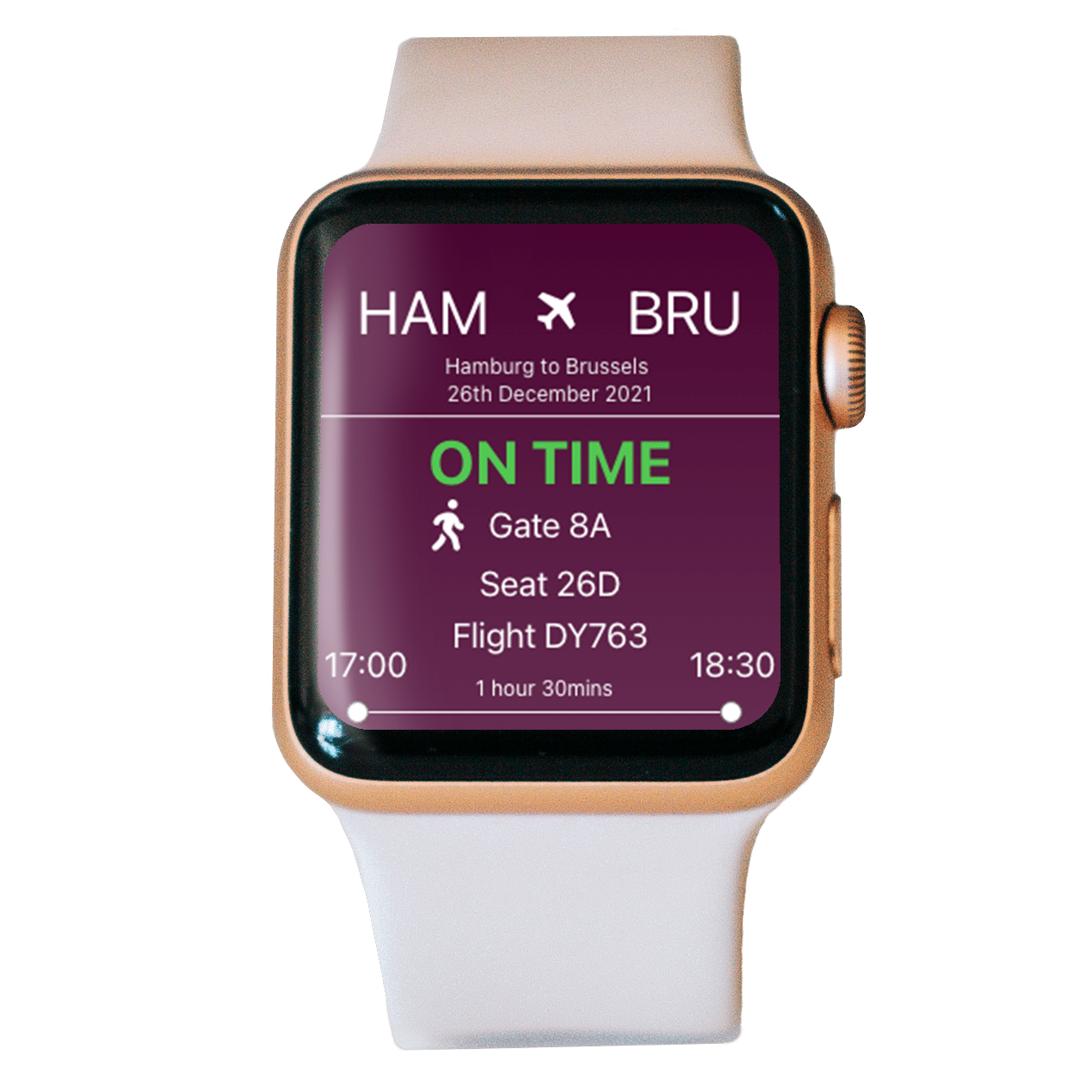
SkySmart is an app for both mobiles and smartwatches. The main goal is to make a hassle-free travel experience for the user. The user can both book travels, and have easy access to the boarding card - on both mobile and the smartwatch.
Our target user is tech-savvy, and a frequent traveler. She’s mostly traveling for business and has busy days.
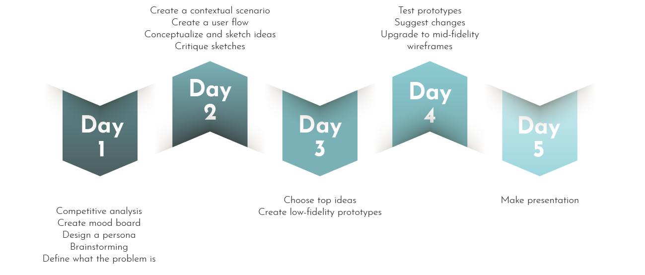
This was a school project, and we were just doing parts of the design thinking process: Empathise, ideate, and mid-fidelity wireframes. We were already given information about our target user.
We were a team of three working on this project together, we took part in all parts of the process.
tIMELINE
LIFE IS STRESSFUL, EFFICIENCY IS THE KEY
To gather information about the target users we did a competitor analysis for quantitative data, and interviews for qualitative data.
Insights from interviews
For all the participants the main goal was to do a simple task fast. Two pain points that showed up were slow interface and too many steps to get to core functions.
They were all interested in an app like SkySmart.
AMARITA IS IN A HURRY
Together with the information given in the brief and our insights from our interviews, we created a persona, a user scenario, and a user journey.
HOW TO MAKE LIFE EASIER FOR AMARITA
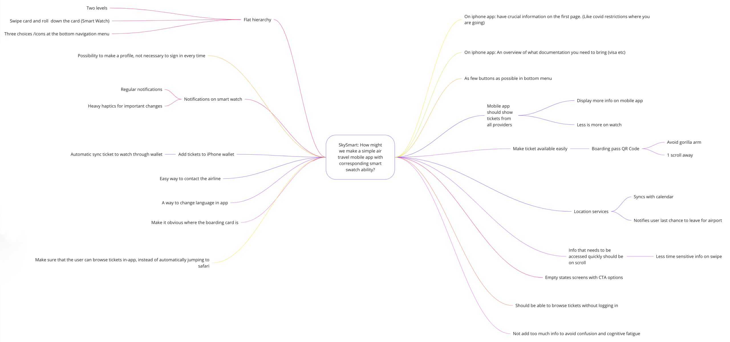
How might we make a simple air travel mobile app with a corresponding smartwatch ability?
User flow

Task flow

Low fidelity wireframes
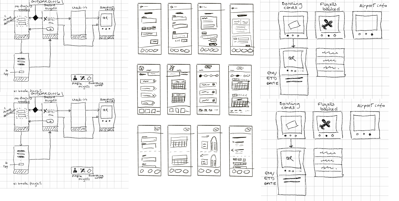
wireframes critique
Home screen
We have chosen screen 4.
The “Hi [user name]” gives a personalised and delightful experience, and we believe our persona will like her previous trip details in order to invoice.
We have chosen screen 6.
To reduce the cognitive load the information is segmented and grouped into logical fragments.
Since people usually buy round-trip tickets, so it is more intuitive to have that option listed first, and the one-way option listed second. For round trips, two calendars will appear, and for one-way, only one single calendar will appear. Once the date is chosen, the drop-down will close and thus reduce the amount of clutter on the screen. The flexible dates give the user the opportunity to find cheaper flights on different days. We have also added a possibility for the user to see offers that match their luggage needs.
The search button is wide to accommodate both right- and left-handed users
We have chosen screen 2
The look of the trip information title has the same look as the apple watch version to ensure consistency.
To get more information about the trip, Amarita can click the open card button.
More readily displayed information, gives her enough information to make a preliminary choice. She can expand the information if she would like to know more than basic details. We have tried to reduce the paradox of choice and reduce the cognitive load, by letting Amarita decide if she needs to see more.
We have chosen screen 2.
To not just use color to indicate which seats that are not available and which seat is chosen, we chose to also use symbols. The selected seat is more prominent and easily visible.
The graphic of the seats is more centered, as it's better to keep clickable options on a touch screen away from corners. Cancel and next buttons are wider, allowing ease of use. In addition, they are slightly more centered reducing errors that occur when at the edge of the screen.
Screen break gives a clearer indication that you can scroll to see more seats.
Chosen: Screen 1
We have chosen screen 1 as this is a more familiar design. Users spend most of their time
elsewhere on the internet so we should aim to emulate familiar designs. This choice is also consistent with our other design style choice.
Labels on form fields are on the top to be visible at all times, to guide Amarita, and the width of input fields corresponds to the amount of info, reducing cognitive load.
The app will auto-fill the form if Amarita has completed her profile information.
Chosen: Screen 1
Familiar design and segmented sections of information, to reduce Amarita’s cognitive load, and ability to fix mistakes with the edit symbol
The price is listed both in the booking summary and on the «Confirm and pay» button to remind her of how much they are paying.
Amarita must check the terms and conditions checkbox before paying. This also is common
practice when purchasing something online – and should therefore be recognizable to the user.
Home screen
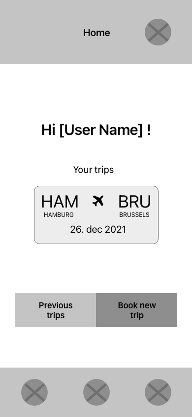
Amarita returns to the home page with a confirmation about her new trip and a link to her trip information.
Boarding card

When Amarita has active boarding cards the QR code will be shown on the main page for quick access. This also means that she doesn’t have to do one more click to get to the boarding card.
We have chosen to have more than one access point to information such as a boarding pass. Allowing Amarita to quickly access this. This means that if she is used to scrolling – she can scroll to the boarding pass, and if she is used to swiping – they can swipe.
The boarding pass will be the main screen, as this is the objective the most important info in the hierarchy, next is current flight info.
Instead of having separate screens with boarding pass info and flight info, we have compressed everything into one screen, which shows all relevant info at a glance. When Amarita needs her boarding pass, she can easily scroll to the QR code.
This solution is based on Apple’s wallet function
OUR CONCIDERATIONS
When designing for mobile apps it’s important to keep the main actions inside the “thumb area” with the most used features at the bottom part of the screen.
We have put our main navigation bar at the bottom of the mobile screen, for easy access while holding the phone with only one hand. On the other hand, people prefer to touch and look at the center of the screen, so this is where we have put our main actions: Book a flight and see reservations.
For smartwatches, it’s most common to use the index finger, which makes the whole screen equally accessible, the biggest issue with a smartwatch is that the screen is very small, compared to a regular index finger. For that reason, we’ll stick to only one item on each card. To reduce arm fatigue and frustration, all functions are available within three levels.
The interface must be minimalistic and with clear words and icons, so the users get the information they are looking for immediately.
A smartwatch can be used in any situation, and most often the user only looks at the watch for a couple of seconds, so the app must be extremely light and not let the user wait.
For critical notifications like changes of status, gate or time we’ll use haptics. Haptics should be used with care, as they grasp the users' attention immediately and interrupt what the user is doing.
Colors and contrast play a huge role in the readability of the app, especially the smartwatch app. The watches can be used in a range of different light conditions, so to communicate hierarchy, font size and weight can be used wisely. We have chosen to use the font size for the smallest apple watch on the market.
It’s also important to take privacy into consideration since the screen of the watch is more difficult to hide.
The QR-code for the boarding pass is made as big as possible on the smartwatch, not necessarily because of the technology, but during our competition analysis, we found that this was the common practice, and for usability reasons, the user will feel safer when the interface is familiar.


