HOW DO WE MOTIVATE YOUNG PEOPLE TO CHOOSE TRADITIONAL PROFESSIONS?
Using the Design thinking method to create an app for recruiting new craftworkers.
In Norway, we are currently experiencing that jobs within certain traditional crafts are in danger of dying out. The reasons are many, but the biggest causes are low recruitment numbers, a perceived lack of relevance for traditional crafts in our modern society, and that people simply don't know that these options exist.
Because considering the myriad of options out there – how do you know which career path to choose? It can be a nerve-wracking process to ensure that you are making a fully informed decision about “what to do with your life.”
With this app, we aim to
Inform and inspire young Norwegians to think outside the box.
Help them make informed decisions about their career choices regarding traditional crafts.

the design sprint team
This is my final exam, which I did together with two other students. We did a 5-week design sprint and worked together on every part of the project using the Design Thinking method.
Our stakeholder, Herstory AS, is an innovative film production company based in Trondheim. They want to change the way the film business is working and tell stories in a new way - on the platform where their viewers are.
WHAT WE LEARNT
During this 5-week design sprint we have reinforced our ability, confidence and understanding in the design process. This project has allowed us to experiment and be adventurous with our solutions, using modern technology to find solutions to declining heritage trades, and the lack of information for new generations to take up these professions.
We were able to continuously scrutinise our work, embracing the nonlinear nature of the design process. This was particularly beneficial when testing our wireframes, not only did we gain constructive criticism regarding our design but we were able to reflect on our performance as moderators. We learned to remember that our participants won't necessarily understand ‘design’ language and we should adapt so that they are confident during testing.
We furthered our research when necessary, adapted with our developing insights, and explored our creativity, taking many opportunities to improve our work and gain a deeper understanding of our target users.
THE DESIGN THINKING PROCESS

GETTING CLOSER TO THE CORE PROBLEM
We started with the empathising stage to understand what the user is experiencing. The goal was to identify what the root problem was in order to come up with the best possible solution – and the best possible product.
We used the 5W+H and the five why's to find out more about the problem, and out of these, we crafted our research goals.
High Priority Research Goals
- Why are young people not choosing heritage professions?
- What can be done to avoid heritage crafts from becoming more endangered?
- How do we make heritage craft information appealing to a younger generation?
Low Priority Research Goals
- How are the heritage professions still valuable to society?
- What are the biggest challenges for those working in the old crafts?
RESEARCH METHODS
Quantitative
Initial interviews
Survey
Qualitative
Survey
Literature review
Attitudinal
Interviews
Behavioural
Competitive analysis
RESULTS
We had 104 responses to our survey, and 2 interviews. Since there are not many apprentices or young people working with traditional crafts, the reason this app is needed, it was hard to find several interviewees.
From our research, we gathered 69 facts, of which we condensed into 13 insights and 5 recommendations.
We learned that the main pain points were that people didn’t see the need to preserve old crafts, and those who did think it was important were also those who were concerned with sustainability and quality. From our literature reviews, we found out that there’s a new trend of combining the old crafts with new technology.
INSIGHTS
- Teaching and learning methods have changed drastically since the school was digitized, creating new learning spaces and opportunities.
- Trends in society show that people are becoming more aware of sustainability and reuse
- New technologies can add new aspects to old crafts and make them current and sustainable again
RECOMMENDATIONS
- New technologies and digital tools must be used to maintain interest in old crafts and make them sustainable.
- Create more awareness around the importance of keeping the small and worthy of protection crafts alive and sustainable.
- Inform about the value of preserving not only the craft but also the knowledge
In order to develop a deep understanding of our users, empathy mapping was used to create a more nuisance picture of a possible target user.
We collected our data from literature reviews and preliminary interviews to visualise who our user is at a glance. This process provided us the ability to meaningfully innovate, as we gained a deeper, unbiased insight and helped construct our primary user.
We used affinity mapping to gather our data and create themes from this information
From these themes, we established a deeper understanding of our problem which ultimately helped form our problem statement.
MEET EIRIK, 16 Y.O., OUR GUIDE TO FURTHER DESIGN
Our primary persona, Eirik Nordmann, acts as a focal point in our design process. This persona was developed from our empathy mapping, literature review, and preliminary interviews.
The goal of our persona was to inform our design with “concrete instances rather than abstractions and generalisations”, this enabled us to make empathetic design choices, always considering our user's needs and experiences
FIGURING OUT WHAT EIRIK LIKES
Idea Selection Methods
At the start of our ideation process, we had a workshop to generate ideas and viewpoints which we could use to further develop our solution. We started by brainstorming answers to certain questions to help guide the rest of the process.
Our brainstorming questions were:
Who is experiencing the problem?
What is the problem?
Where does the problem present itself?
Why does it matter?
Point of view-statement:
User: Young people
Need: information and motivation
Because it's hard to recruit new workers for rare professions
"Young people need motivation and information about rare- and traditional professions because it's hard to make a non-conforming career choice."
Problem Statement
"Young Norwegians can't make a fully informed decision about career choices as they aren't presented with enough information or given the ability to subvert the norm of the current educational system. As a result, old crafts are diminishing due to a perceived lack of relevance in our modern society. If we can solve this problem we can help preserve our collective history and guide young people to make a fully informed decision about their futures".
Value Proposition
“Our solution will motivate students who want to get an education by informing about traditional professions”
IDEATION
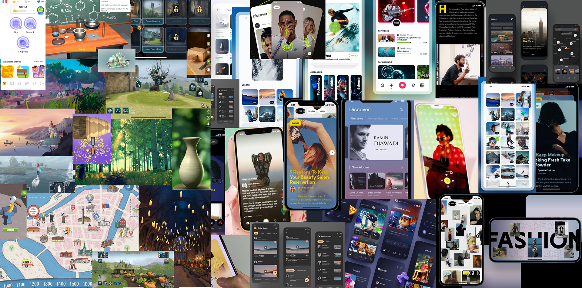
TOP IDEA: USING GAMES AND VIDEOS TO INFORM AND MOTIVATE EIRIK
INSPIRATION

SKETCHING OUT THE PATH TO GO FOR EIRIK
We started with pen and paper and made some quick sketches of the different screens. We then chose the ones we considered the best, and upgraded them to mid-fidelity wireframes.
EARLY TESTING GAVE US USEFUL FEEDBACK
It’s never the wrong time for testing. We wanted to check our mid-fidelity wireframes before we started with the high-fidelity. We also did an A/B-test to gather information about how easily and understandable the interface of the simulator was.
The feedback gave us valuable insights, and we realized we had to do some severe changes to our icons.
Home page
Change icons in the menu
Add a search bar
Onboarding
Explain the different functions
Needs to communicate that we have a simulator/virtual museum
Video page
Remove the tabs
Insert a search bar in thumb reach
Remove slow-tv
Add time stamps
Simulator/virtual museum
Remove timeline in menu
Add the option to choose the year inside the simulator (button)
Consider the platform – fingerprints/different symbol
Accessibility
Choosing the right icon on the map can be hard for people with physical disabilities, so the alternative screen with map will be discarded, even 2 out of 3 participants preferred it over the other alternative.
FROM MID-FIDELITY WIREFRAMES TO HI-FIDELITY WIREFRAMES
colours
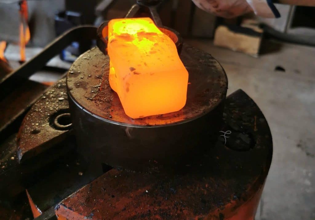
The colors are picked from a photo of a modern forge. Based on modern color psycology we have chosen a warm, orange/red color palette, with green to calm and balance the design.

Typography
We followed the mobile first approach, and also took the WCAG 2.0 standards in consideration.
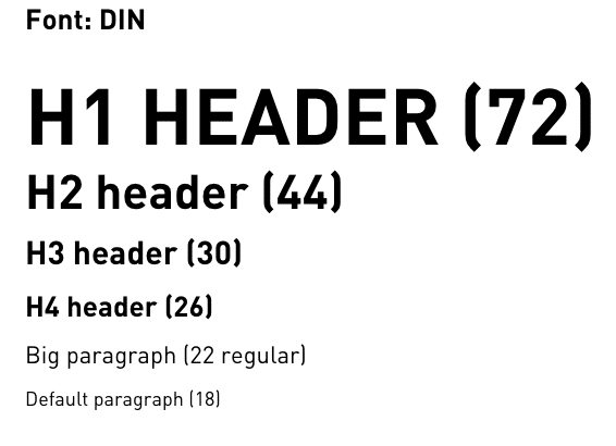
We have chosen the DIN font, since it's neutral, clean and feels strong.

Spatial system
We have chosen a spatial system where all sizes are divisible by 8.
For smaller elements, like buttons, the size should be divisible by 4 px.
ACCessibility
It was important for us to design with accessibility in mind. Our first consideration was touch targets, this was particularly aimed at our bottom navigation and giving users more room for error when navigating. The layout of the simulator menu was chosen for accessibility, the interactions are divided into three invisible large touch zones to enable a larger hit point. All copy was checked against the WCAG standards and met either AA or AAA standards.
HI-FIDELITY SCREENS
Our onboarding screens aim to introduce our user to the concept and purpose of our application. We have considered the principle of Jakob's Law, our users spend most of their time on the internet elsewhere, for this reason we have used our copy as a way of explaining the application's function.
When designing the Home Screen for our application our goal was for this to act as the landing page for the application, the hub to return to and navigate from.
We have taken both Hick's law and Fitt's law in consideration when designing this screen.
Our Video main page is laid out in a card format that allows the user to use a scroll gesture to go through videos. We chose this layout in order to follow the Law of Continuity and Jakob's law.
Simulator menu

Law of continuity:
On this screen all the professions are aligned in a straight line to illustrate that they belong to the same ´group.ª
Law of focal points
In the room interface we have buttons that stand out with a bright color, so the user easily can see what they can do.
READY FOR PROTOTYPE TESTING!
GOALS
We have taken the insights from wireframe mid-fi testing, adding new icons. We hope that hi-fi testing will solidify our choices and users will find the icons more intuitive.
A search bar has been added, allowing users to intentionally search for information on the app and onboarding has been fleshed out. Hopefully, this will inform users of the purpose behind the app.
Area of focus
Does the visual interface make sense?
How do the participants understand the icons?
Is the simulator intuitive?
Hypothesis
Users will find the path to the simulator, and the simulator, easier, if we have a more recognizable icon in the menu with an explaining subtitle.
Users will more easily understand how to navigate the simulator if we use more common icons.
If we create an informational onboarding the users will be more prepared and more likely to understand the different functions in the app
Metrics
Success rate:
Were the users able to complete the tasks without any assistance from the moderator?
MAIN KEY PERFORMANCE INDICATORS
Learn about the icons' comprehensibility
Learn about the comprehensibility of the interface
Learn about the design of the simulator
Learn about colour preferences
Why?
To improve the design and make it more intuitive and delightful
OUR APP HAD NO BLOCKER ISSUES!
What designs did we test?
Onboarding
Home screen
Video screen
Simulator
Tasks
Identify the icons
Watch a movie
Explore a profession
We identified 16 issues, 4 major, and 7 minor, but no blocker issues. The participant's overall impression was a 4 out of 5, but from the comments, we could observe a 50/50 % positive/negative attitude. The overall impression was probably tainted by the end of the experience. All our participants liked the idea of the simulator when they understood it, so this might be the reason for the high score on impression, and the lower score on the attitude during the test.
After analysing our findings we came up with 9 possible solutions with different severity, and we have chosen to refine those that will give us the highest ROI considering effort and effectiveness.
- Rewrite the copy on the onboarding screens, especially screen #3 about the simulator
- Change the copy and thumbnails on the simulator menu
- Change the navigation buttons in the simulator
- Add tooltips to the home screen.
Key deliverable:
Users will find the app more delightful, interesting, and educational.
FINAL RECOMMENDATIONS
Our high-fidelity usability testing provided us with valuable insights into our design, allowing us to present our final recommendations. We have iterated some of our designs to meet our new recommendations, in order to provide insight into the development of this application. Based on our usability test participant’s feedback, our main recommendations are as follows based on their value, the cost to implement, and KPIs:


